
Interview: Panel x Panel
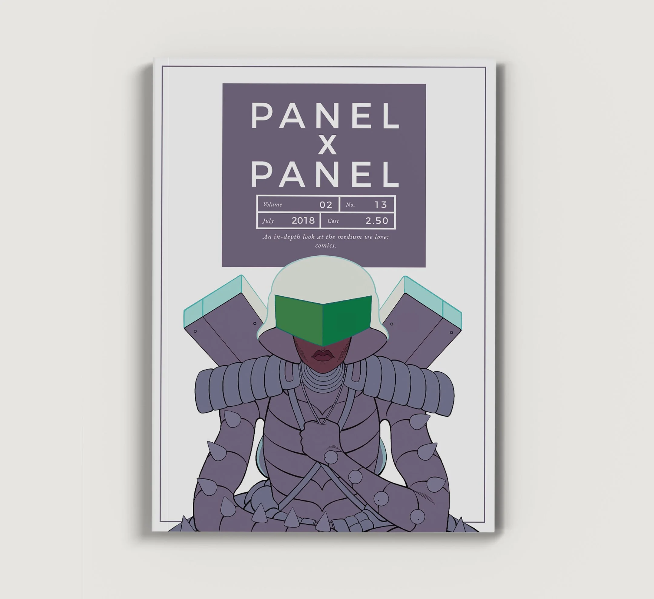
Interview with Editor Hass Otsmane-Elhaou in Panel x Panel, Vol 2, No. 13, for the Eisner Award-winning monthly magazine celebrating the very best in the comics medium.
PxP: We've talked already about the symmetry and the idea of characters bouncing around each other, and it looks like you work to mirror that in the colors, too? Herod has this intense neons, while Kirby's world is a little more orange, and Stella's ends up being this soft purple, almost in between?
H. MOORE: I've been very intentional with color choices for characters and their interior/exterior environments to add another layer of non-verbal dialogue to the world. Colors in TNW speak of power, control, confinement, fear of ambiguity, aggression, anxiety, homogeneity, heterogeneity, resistance, love, play, growth, paradox, and really so much more.
They evolve throughout the series, acquiring new importance, meaning, or just simply assume a different role.
Stella and Kirby's respective environments are meant to serve as opposites, yet parallel one another and sometimes overlap harmoniously in many ways. The choices for Stella's place did have specific intent, whereas, Kirby's came forth from feeling—which is befitting of both characters.
PxP: You tend to opt against anything too flashy, not many effects are being used, and I'm wondering if this was rules you'd specifically set for the look?
H. MOORE: Sparing usage of color effects avoids over-saturation and makes individual moments of importance feel more impactful.
In TNW, I didn't want to adhere to either side the minimalist/maximalist binary. By doing so, I hope the world will feel extremely nuanced and balanced (overall) to readers. There's definitely an undercurrent of "natural," tame color schemes which converse with jarring, artificial, and dream-like colors and effects, as well as everything in between, at different points in time. I approach effects from a cinematic lens in many instances. I really try to use my tools as a colorist to navigate time, reality, and to traverse the depths of feeling. Oh, and one of my favorite techniques is color vibration!
This has been a completely explorative process for me, so I didn't set any rules or expectations for myself other than just that—to explore, meander…. on the beaten path, off the beaten path, in the river next to the beaten path, in the sky, in a trash can... Really just going with the flow, you know?
PxP: Were there any works that set you off in a particular direction?
H. MOORE: There were only a few specific visual references: Kerascoet and Hubert's Beauty; Gianni De Luca's Romeo e Giulietta; Blade Runner; Beyond the Black Rainbow; Yayoi Kusama's Infinity Mirrored Room - The Souls of Millions of Light Years Away and Peep Show - Endless Love Show exhibitions; Alice in Wonderland.
But I do feel like my overall artistic lens has been permanently influenced by so many other works/creators over the years, many of which have probably subconsciously influenced my aesthetic approach to the TNW. To name a few (in no particular order): Mitsuo Katsui; Jodorowsky; Sailor Moon; David Lynch; Tadao Ando; Wong Kar-wai & Christopher Doyle; Tadanori Yokoo; Egon Schiele; James Turrell.
My references are not limited to the visual, though. Colors in many scenes were also influenced by a few key non-fiction texts, as well as music I was listening to at each point in time.